Analysis of stand design
Okay, this is going to be a LONG post about Araki’s stand design, because looking for patterns in designs is something I REALLY enjoy and I want to talk about it a lot lmao
Designing a stand that fits well into the universe has everything to do with analyzing existing stands and seeing what design aspects they have in common! Decide which part you want your stand to fit into, or which part’s stand aesthetic you like best, and focus on analyzing those stands in particular, to narrow down your influences.
In parts 3 and 4, the non-object stands are still quite organic, many of them actually looking like living creatures. You look at stuff like Star Platinum, Magician’s Red, Tower of Gray, Hanged Man, Empress etc and they all come across as creatures. Because this is early in stand development, there are few unifying factors among them, because Araki was still looking for the right aesthetic. Hierophant Green was the first stand to have what later became standard ‘stand eyes’.
As part 3 goes along, stands are slowly starting to take a more unified shape; The Fool, Judgement, Osiris and Atum, and also Cream to an extent, all start looking more artificial/robotic. ‘Stand eyes’ become more common.
Here’s an excerpt from Araki’s interview in Jojonium Vol.15;
When I design Stands, I often take inspiration from artifacts such as clothing, masks, and dolls from indigenous peoples. Once I fuse that aspect with something biological or mechanical, it makes a really unique design. Originally, I imagined Stands as being something inorganic powered by life force, so it makes sense that a lot of their designs are fusions between living beings and machines. The Fool’s design starts out with a dog, and then adds on a Native American mask and the tires of a car. I think The Fool really represents my ideal design for a Stand.

Part 4 has a similar approach to stands as later part 3, there are a few more organic ones (Killer Queen, Stray Cat, Pearl Jam), but most others have some artificial aspect to them.
Part 5 has the first bigger shift in stand design. This is where stands stop looking “soft”. A lot of them appear to be covered by harder surfaces, their faces look like masks, many of them have some sort of helmets. Moody Blues is an interesting one, as he’s supposedly covered in vinyl. There are always exceptions because while most stands tend to follow similar design rules, there’s really no one way a stand can look, since we have object stands like Strength, Cream Starter and Beach Boy, and animal-esque stands like Clash. Talking Head, for example, seems almost entirely organic aside from its eyes.
Speaking of eyes, in part 5 there are VERY few exceptions to the ‘stand eyes’ rule, ‘normal’ organic-looking eyes are getting more rare.

One thing I noticed with part 5 stands was that a lot of them appear to have an “exposed” midriff, their designs often look like they consist of a chest piece and pants.
Some more things a lot of stands tend to have throughout parts are elbow and knee guards or segmented-looking joints, studded knuckles, and segmented fingers. The latter two are ESPECIALLY common and appear in nearly every design.
Some more things a lot of stands tend to have throughout parts are elbow and knee guards or segmented-looking joints, studded knuckles, and segmented fingers. The latter two are ESPECIALLY common and appear in nearly every design.

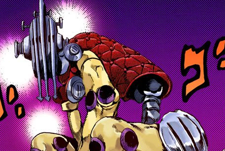
With part 6, one notable change I picked up on is that a lot of stands tend to have patterns on their bodies, which are distinctly different than the ‘armour’ patterns that part 5 stands have (Gold Experience, for example). Stone Free has little bumps all over, Kiss has stickers, Whitesnake has the GΔCT stripe pattern, Under World has some interesting symbols on its torso, and then you have Yo-Yo Ma and Planet Waves who seem to be textured. Previously stands had minor patterning (with exceptions, as always), but that changes a bit in Stone Ocean. There are also several stands here who just plainly have no face at all, like Diver Down, Marilyn Manson and Jumpin’ Jack Flash.
Since I just mentioned Marilyn Manson, I might also point out that there are VERY FEW stands with any sort of hair or fur. I could only count 6 between all the parts, so take this into account!
I’ll skip part 7 because it seems Araki tried doing something quite different with stands in this part, making their appearance less prominent as they work directly through their users instead, and because of that part 7 doesn’t really seem to have a unified stand design as the stands range from a spray, to a rope, to a mask, to a literal dinosaur, to balloons, and then to a few more common bio/mech stand designs. Among these, Civil War is a great example of what’s to come.
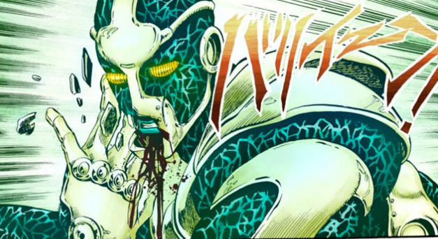
Jojolion is currently the furthest Araki got with his stand design concept.
Stands in Jojolion are distinctly more artificial-looking than they are organic. You could mistake Star Platinum or The World for a creature, even a human, but there’s no way you could mistake any of the Jojonium stands for something “real”.
Soft & Wet is literally a robot. Nothing about its design looks like it’s made of a soft material (ironically), except for maybe its neck;

Looking at Jojolion stands, standing among human characters, there’s absolutely no way to mistake any of them for a being of this world;

Not all of them look as robotic or even outwardly mechanic as Soft & Wet, but even those with most of their body looking soft don’t look like they are human, such as Nut King Call for example;

Jojolion has BEAUTIFUL stand designs, and if you follow their design pattern you’d probably be able to design something that looks like a stand the easiest, because these designs really pull forwards the essence of what matters in a stand design. You’ll notice that the stand eyes, segmented joints and studded knuckles are still present.
If Jojolion stand aesthetic doesn’t quite appeal to you and you want a slightly more organic stand, then I’d recommend you look into part 5 & 6 stands as inspiration, as they have a great variety of designs you can analyse.
If you want to look into colour aesthetics for stands, then I recommend you look at Araki’s traditionally coloured pieces, not the anime or the digital colouring, as his colours are generally much more unique and ‘alien’, just like stands should be.
